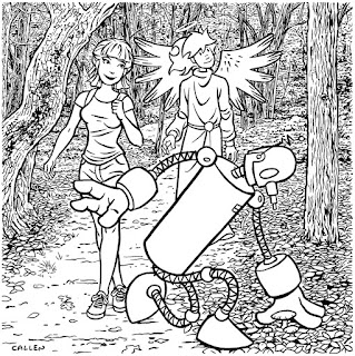
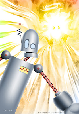
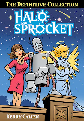
It's abridged (and better) work. I took the opportunity to change aspects that has bothered me over the years. I tightened up some of the art and spiffied up some of the dialog.
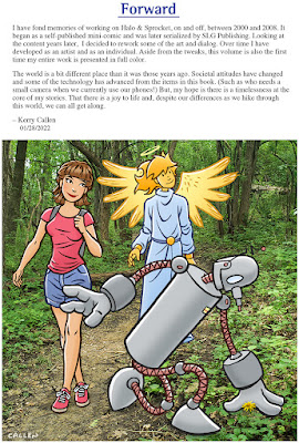
Aside from creating new art for the cover, I also created a new piece for the Forward.
I initially drew the background for this page. As I started coloring it, I decided I loved merely using one of my hiking photos instead!


10 comments:
amazo link busted :0
Oh no! Thanks for the heads up! Hopefully it now works--
Is it too late for you to correct the spelling of “Forward” to “Foreword” in the book?
Oh poop. Would you believe that "Forward" is a play on words, anticipating a bright future for all of us? No? I'll check into fixing it. Embarrassing. Thanks for pointing it out!
This came out in February and I'm only now hearing about it! Snapping it up right now.
Thanks, TB!
I just ordered mine. Looking foreword two it!
Thanks, Ed!! And-- Ha ha! I see what you did there.
It was fun comparing the new revised book to the "old" versions I already have. Not that many revisions, but interesting.
Is a circular "victory" meter really better than a thermometer-style one? Inquiring minds want to know!
Ha ha! Two reasons I changed the meter-- 1. I thought it was visually too similar to kitten/shink meter in the previous story. 2. I added a meter to page 10 of the story (I didn't want the meter at the end to come out of nowhere) and a circle fit better.
Post a Comment